Showing posts with label research. Show all posts
Showing posts with label research. Show all posts
Tuesday, 22 January 2013

Saturday, 22 December 2012
Title Credits Research
ORDER OF OPENING CREDITS
Production Company presents
"Title"
Lead Cast
Supporting Cast
Casting Director
Music Composer
Costume Designer
Associate Producers
Editors
Production Designer
Director of Photography
Producer
Writers
Director
Though we have decided not to use every title listed above (our title sequence would not be long enough to list all titles but we plan to include the titles in bold), it is important that we know the order of them so that the authentic of our title sequence is enhanced. Our chosen Production Company is Hammer Films as they specialise in films the same genre as our own: horror.
Thursday, 20 December 2012
Friday, 14 December 2012
The Importance of Typography
Se7en Typography Analysis

The font used in the Se7en opening sequence appears shaky and as if it has been handwritten. The style in which the cast/crew's names are written in is mismatched in comparison to other words on screen, creating a disorientated atmosphere and possible foreshadowing contrasting personalities in the film. The shaky manner of the text suggests unstableness but this contrasts with the shots of obvious organization demonstrated through mise-en-scene. Once on screen, the writing sometimes flashes which again could disorientate the audience and the colour of the font is white which carries connotations of purity and innocence. The colour of the font creates a contrast between the shots we see of needles and a man's eyes being crossed out in a threatening manner.
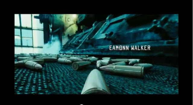
The font used in the Lord of War opening sequence is also white, which contrasts with the shots we see of guns being made and used, as it suggests purity and innocence. The typography resembles that of a military font, which links with the title of "Lord of War". This suggests violence and conflict and also resembles soviet Russia type writing, which could foreshadow an important place in the film.
It is important to analyse typography so that when we decide the font for our title sequence, we are aware of everything it could suggest and the mood it creates when paired with our chosen footage.
Lord of War Typography Analysis
It is important to analyse typography so that when we decide the font for our title sequence, we are aware of everything it could suggest and the mood it creates when paired with our chosen footage.
Thursday, 29 November 2012
Audience Profile
We decided the demographics of our audience profile in our group but in order to help us gain the psychographics information, we conducted a small survey like activity among our target audiences in which we inquired about their hobbies and interests.
Monday, 19 November 2012
Sunday, 18 November 2012
Monday, 12 November 2012
The Art of Film Title
The
following article discusses the impact of opening sequences.
“Words and lettering
played an enormous role in films of the silent era. Film titles made their
appearance in the earliest silent films, along with letter cards (or inter-titles),
which provided context. These cards were the responsibility of the lettering
artist, who collaborated with the scriptwriter and director to create narrative
continuity so that audiences could follow what they were seeing.” This extract emphasis the
importance of typography in films, by linking it back to silent films where it
was relied on heavily due to the absence of dialogue. Without text, the
audiences might find it difficult to keep up with what was going on and it
helps them to keep the plot flowing in their head clearly. It also touches upon
how the letter cards were so important there is an entire job dedicated to it
and important people such as the director have an involvement in the text
because, without it, the plot of their film or just interest in the film could
be lost.
“The main title from the
American release of “The Cabinet of Dr. Calligari” (1920) is much less
expressive than the title from the influential original German film.” This sentence shows that
the style of the text is changed to fit in with the time and place of release.
“Other important early
filmmakers such as Emil Cohl and Winsor McCay were accomplished draftsmen who
dedicated years of their lives to discovering the dramatic potential and
practical techniques of animation. The focus was more on character development
and story visualization than on title animation per se. So, while we see
innumerable novelties in main titles and inter-titles during this period, the
big innovations of title animation and motion typography don’t really emerge
until well after the Second World War.” This point touches upon the introduction of
animated title sequences. The sequences created by filmmakers listed began to
incorporate a narrative element into title sequences so making it link in the
characters or plot of the film, rather than just the physical appearance of the titles. However, the differences in focus were not really noticed until after
this time period.
“During the 1920s and
‘30s, European cinema was deeply influenced by modernism, and aspects of this
visual sensibility were brought to the US by filmmakers who were fleeing the
Nazis. Meanwhile, the studio systems operating in Europe and Hollywood also
delighted in creating titles that featured vernacular graphic novelties. As
much as possible, they liked to convey the tone of a movie through the
“dressage” of its main title. Thus, the blackletter fonts in the opening
credits were used to evoke horror, ribbons and flowery lettery suggested love,
and typography that would have been used on “Wanted” posters connoted a western
flick.”
This brings up the introduction of certain iconography we now heavily associate
with certain types of films. Film makers began to use text to suggests the
on-going tone of the film which is important as text is used to do that every
day now- we all associate certain texts and colours with horror films or love
films.
The
article mentions how, during the 1960s, people who created title designers for
famous directors whom relied heavily on text were very successful and well
known – (“Directors like Otto Preminger,
Alfred Hitchcock, Blake Edwards and Stanley Donen embraced these innovators and
gave the reign to surprise audiences/”By the mid-1960s the top title designers
were celebrities in their own right”)
“The imagery behind the
credits received a lot more attention. Still, the interplay of typography and
images was by no means ignored.” During the 1950s, text wasn’t the only thing
relied upon in a title sequences but also the pictures too. It was during this period that pictures and
texts began to work together. However, text was still important as it started
to be used as a logo, and therefore a selling point, for films. “Saul Bass often approached the lettering of
a main title as he would a logo, making it function are the core element in a
full-marketing campaign.”
Minimal
things on screen were also popular at points (“Ridley Scott’s Alien” and “Le
Dernier Metro” directed by Francois Truffaut”).
Subscribe to:
Posts (Atom)