Monday, 31 December 2012
Saturday, 22 December 2012
Title Credits Research
ORDER OF OPENING CREDITS
Production Company presents
"Title"
Lead Cast
Supporting Cast
Casting Director
Music Composer
Costume Designer
Associate Producers
Editors
Production Designer
Director of Photography
Producer
Writers
Director
Though we have decided not to use every title listed above (our title sequence would not be long enough to list all titles but we plan to include the titles in bold), it is important that we know the order of them so that the authentic of our title sequence is enhanced. Our chosen Production Company is Hammer Films as they specialise in films the same genre as our own: horror.
Thursday, 20 December 2012
Wednesday, 19 December 2012
Title Sequence Progress
We have researched appropriate soundtracks for our title sequence and, as a group, have narrowed it down to four possible tracks that we feel could work to create an eerie atmosphere during our sequence.
We are still to decide on typography but we have all agreed that it should be red in order to fit in with the horror genre.
Friday, 14 December 2012
The Importance of Typography
Se7en Typography Analysis
The font used in the Se7en opening sequence appears shaky and as if it has been handwritten. The style in which the cast/crew's names are written in is mismatched in comparison to other words on screen, creating a disorientated atmosphere and possible foreshadowing contrasting personalities in the film. The shaky manner of the text suggests unstableness but this contrasts with the shots of obvious organization demonstrated through mise-en-scene. Once on screen, the writing sometimes flashes which again could disorientate the audience and the colour of the font is white which carries connotations of purity and innocence. The colour of the font creates a contrast between the shots we see of needles and a man's eyes being crossed out in a threatening manner.

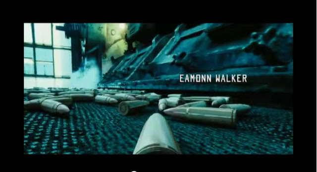
The font used in the Lord of War opening sequence is also white, which contrasts with the shots we see of guns being made and used, as it suggests purity and innocence. The typography resembles that of a military font, which links with the title of "Lord of War". This suggests violence and conflict and also resembles soviet Russia type writing, which could foreshadow an important place in the film.
It is important to analyse typography so that when we decide the font for our title sequence, we are aware of everything it could suggest and the mood it creates when paired with our chosen footage.
Lord of War Typography Analysis

It is important to analyse typography so that when we decide the font for our title sequence, we are aware of everything it could suggest and the mood it creates when paired with our chosen footage.
Monday, 3 December 2012
Title Sequence Progress
So far, I feel as if we are on the right track in regards to creating our opening sequence. We have our film idea established and resolved the issues that came up in the form of feedback from the class once we presented it together as a pitch. Initially, we struggled with coming up with a horror film plot that was original and entertaining and were worried that we would not have an idea in time for the class pitch however once we agreed on an idea of a haunted orphanage, we found it relatively easy to develop and successfully finished our pitch in time.
We also struggled with points to include in the audience profile- we had a brief outline but were not sure how to develop on it- however once we were given feedback, we understood the amount of detail that needed to be included and have started work on developing it.
After brainstorming, we have agreed on certain visual and sound elements that we think will be affective and will make up our opening sequence. We are now in the process storyboarding our sequence and getting the props we need.
Blog Feedback
Overall, I am happy with my feedback. I felt as if we struggled with creating the audience profile, especially regarding the detail, so agree with the comments that it needed developing and possibly reconstructing. We have since changed our ideas of a house burning to a shots of a destroyed dolls house, as we too realized it would be difficult to film. Regarding the fight scene, I agree with the comments given however we thought that we had been instructed to take the background sound out. I plan to add in the points that I was lacking in some of my class notes but am generally very happy with the comments given from my teacher in response to my analysis', research, homework and blog in general.
Subscribe to:
Comments (Atom)


