Se7en Typography Analysis

The font used in the Se7en opening sequence appears shaky and as if it has been handwritten. The style in which the cast/crew's names are written in is mismatched in comparison to other words on screen, creating a disorientated atmosphere and possible foreshadowing contrasting personalities in the film. The shaky manner of the text suggests unstableness but this contrasts with the shots of obvious organization demonstrated through mise-en-scene. Once on screen, the writing sometimes flashes which again could disorientate the audience and the colour of the font is white which carries connotations of purity and innocence. The colour of the font creates a contrast between the shots we see of needles and a man's eyes being crossed out in a threatening manner.
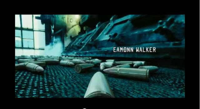
The font used in the Lord of War opening sequence is also white, which contrasts with the shots we see of guns being made and used, as it suggests purity and innocence. The typography resembles that of a military font, which links with the title of "Lord of War". This suggests violence and conflict and also resembles soviet Russia type writing, which could foreshadow an important place in the film.
It is important to analyse typography so that when we decide the font for our title sequence, we are aware of everything it could suggest and the mood it creates when paired with our chosen footage.
Lord of War Typography Analysis
It is important to analyse typography so that when we decide the font for our title sequence, we are aware of everything it could suggest and the mood it creates when paired with our chosen footage.
No comments:
Post a Comment