Friday 15 March 2013
Thursday 14 March 2013
Tuesday 12 March 2013
Tuesday 5 February 2013
Re-edited Title Sequence
Though we agreed on keeping the typography that we originally had but changing the colour of it, our audience feedback all responded that the font itself was too blurry for them to read, no matter what the colour. In response to this, we spent more time on dafont.com and decided on a new typography. We feel as if An Unfortunate Event continues the eerie, spooky tone that we wanted our title sequence to have whilst being more practical in regards to how clear it is. We agree and appreciate our audience feedback that white is a better colour to use because now there is no struggle to read our font.

We debated on using Charles S. Font and did test it out in our title sequence but felt it wasn't connected to the horror genre enough and could suggest that our film was a thriller instead.

We are happy with the changes made to our sequence, especially the typography, and feel as if it has improved. We will again screen our sequence to a group of people that fall into our target audience (teenagers) to confirm that our newly added nursery rhyme works or if the pace needs to be altered.
Monday 4 February 2013
Title Sequence Feedback Editing
In response to the class feedback that our sequence may be eerier/creepier if we added in the nursery rhyme that we originally recorded, we played around with effects that would alter the nursery rhyme and placed it in our sequence. One of the reasons we scrapped it originally was because we couldn't find a place to put it as our soundtrack and foley sound took up everything but we resolved this problem by putting it over the soundtrack and turning it's volume down. Another reason was that we just didn't feel as if it created the eerie atmosphere that we wanted but, after distorting the sound and pairing it with our non-diegetic sound, we played it to some of our peers who confirmed that it made them feel uncomfortable and therefore worked in the way in which we wanted it to.
We have made most of the adjustments possible to our title sequence highlighted from our feedback and are now simply adding the finishing touches, such as adding in fade transitions to the sound so that our sequence flows well and the sound doesn't just cut off.

We have made most of the adjustments possible to our title sequence highlighted from our feedback and are now simply adding the finishing touches, such as adding in fade transitions to the sound so that our sequence flows well and the sound doesn't just cut off.

Friday 1 February 2013
Title Sequence Feedback Editing
We have since started editing to improve our sequence with the help of our class feedback that demonstrated how our target audience would respond. Our main adjustment will be to the font; the class suggested that we changed the colour so that it was clearer to see along with the actual typography and where it was positioned (for the last shot where our title comes up). We are currently looking for another font but are struggling to find one that will work for our sequence. We feel as if Supernatural Knight may be too boring and as if Ed Gein may be too connected to the slasher genre and it is important to us that the audience do not loose sight of the horror genre of our sequence.


We have changed the colour of our first font, 'nervous', to white for the time being and feel as if it has improved the clarity. However, for our last word- the film's title- the white made the clarity even worse so we have decided to just change that to a brighter red. We showed our adjusted title sequence to our peers who confirmed that they could now see the font clearly and so are planning to keep initial font (unless we do manage to find another) because the style still connotes our horror genre the most. In order to confirm that our font does so, we will screen our title sequence again to a wider range of people and see if they think it works.


We have changed the colour of our first font, 'nervous', to white for the time being and feel as if it has improved the clarity. However, for our last word- the film's title- the white made the clarity even worse so we have decided to just change that to a brighter red. We showed our adjusted title sequence to our peers who confirmed that they could now see the font clearly and so are planning to keep initial font (unless we do manage to find another) because the style still connotes our horror genre the most. In order to confirm that our font does so, we will screen our title sequence again to a wider range of people and see if they think it works.


Wednesday 30 January 2013
Title Sequence Feedback/Audience Response
After presenting our clips to the class, they gave us audience feedback. They decided that our camera movement was quite shaky at points, which we agreed with and did attempt to resolve beforehand by overlapping some clips during the production stage. Regarding the absence of our originally storyboarded nursery rhyme, the class suggested that our sequence may be eerier if we added it back in or maybe record some children giggling but, whilst we want our sequence to be creepy, we did attempt this during the production process and it didn't work. We also aren't sure where it could go in the sequence and so we're still debating this.


The class also suggested that our font was not clear enough, due to the colour and suggested a white instead. We originally wanted the colour of our font to be red to connote the horror genre however there are some parts of the sequence where the red makes it difficult to see and so are in the process of adjusting the colour.


The class also suggested that our font was not clear enough, due to the colour and suggested a white instead. We originally wanted the colour of our font to be red to connote the horror genre however there are some parts of the sequence where the red makes it difficult to see and so are in the process of adjusting the colour.
Saturday 26 January 2013
Title Sequence Production Journal
We have completed our story-boarded title sequence. Initially we did not feel as if we were going to finish in time for the lesson to show our sequences to the class for feedback but after staying behind after school to edit, we managed to complete our sequence. There are significant differences between our original storyboards and our finished piece; we cut out one close up shot of a foot running through our stream because we felt it didn't add to the eerie atmosphere we wanted and actually ruined it. We also decided on scrapping the nursery rhyme we recorded for the sequence as we couldn't find a place where it work and ultimately didn't think it sounded creepy anymore. We did, however, refer back to our storyboards often.
For some shots, we felt that the fade transitions we applied were too slow and still prevented our sequence from flowing and so we, after playing around with Final Cut Pro, discovered that we could overlap clips and use that as a transition which not only allowed our piece to flow but also added to the strange, eerie tone that we wanted our sequence to have.
Overall, I am happy with our sequence. I think we were right in making the decisions to change certain elements of our storyboard because they just didn't work as we expected them too and it was important to us that the sequence felt eerie and our previous ideas such as fade transitions or where we originally wanted the opening credits to appear didn't create that tone.
Thursday 24 January 2013
Title Sequence Production Journal
In our recent lessons and free time, we have progressed with our editing. Initially we were having difficulty in incorporating our chosen film logo into our sequence due to internet problems but have since managed to successfully download it and edit it into our piece appropriately, keeping the same original logo of Hammer Productions but adding our own sound to customize it to our title sequence (the trickling of a stream) and create an eerie atmosphere from the beginning. We have also decided to use the burgundy colour seen on the Hammer Productions logo for the rest of our typography so that all the font will match. We chose Hammer Productions as our film company as they are widely known for their horror films.
During our editing, we felt that some parts of our sequence did not flow in the way that we wanted them to so instead of simply cutting some shots, we have started to use different transitions such as fades or dissolves so that the order of clips do not feel rigid but flow properly. We also reshot a tracking shot of photographs on a wall after noticing a continuity error- a difference in lighting in the last tracking shot from the previous two.
During our editing, we felt that some parts of our sequence did not flow in the way that we wanted them to so instead of simply cutting some shots, we have started to use different transitions such as fades or dissolves so that the order of clips do not feel rigid but flow properly. We also reshot a tracking shot of photographs on a wall after noticing a continuity error- a difference in lighting in the last tracking shot from the previous two.
Title Sequence Production Journal
We have chosen the typography for our title sequence and are in the process of adding the titles to our clips. The font we have chosen is called "Nervous" and we chose it because the blurry lines will disorient the audience yet still make the titles on screen clear enough to read.
We still agree that the font colour should be red to connote danger and blood however have realised that this colour may not go with the clips we originally wanted the text to be paired with as they show burning photos and the red may not work in the way that we wanted it to but instead clash with the orange. To resolve this, if our original text position that we storyboarded does not work, we will instead pair the text with early clips of a stream so that the font will stand out more.

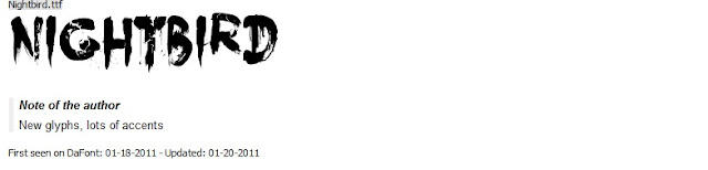
We also looked at other fonts on dafont.com such as "Feast of Flesh" and "Nightbird" but decided that they did not give the eerie, uncomfortable effect that we wanted. We felt "Feast of Flesh" looked too comic book like and that "Nightbird" looked more like something used in a slasher film and therefore would not be taken seriously in our sequence or they would give off the wrong tone.

We still agree that the font colour should be red to connote danger and blood however have realised that this colour may not go with the clips we originally wanted the text to be paired with as they show burning photos and the red may not work in the way that we wanted it to but instead clash with the orange. To resolve this, if our original text position that we storyboarded does not work, we will instead pair the text with early clips of a stream so that the font will stand out more.

We also looked at other fonts on dafont.com such as "Feast of Flesh" and "Nightbird" but decided that they did not give the eerie, uncomfortable effect that we wanted. We felt "Feast of Flesh" looked too comic book like and that "Nightbird" looked more like something used in a slasher film and therefore would not be taken seriously in our sequence or they would give off the wrong tone.


Tuesday 22 January 2013
Friday 18 January 2013
Title Sequence Production Journal
We are currently struggling with our editing process as we are experiencing technical difficulties with Final Cut Pro and with downloading clips needed for our title sequence. However so far we have noticed that, whilst our storyboards are helpful for referring back to, for a small section of our title sequence the order in which we originally planned some clips to appear in reality is not creating the eerie atmosphere that we wanted but we resolved this by simply re-arranging some clips and even cutting out a close up of a photograph of blood in it because we felt that it did not fit in with the unnaturally calm and still tracking shot of a stream.


Monday 14 January 2013
Title Sequence Production Journal
We are now in the process of editing our sequence on Final Cut Pro and deciding on what music we feel will work best. So far, we have made narrowed it down to a list of four possible soundtracks. We have chosen these tracks because we feel they would help create an eerie, on edge atmosphere for the audience whilst linking in with our key children characters through nursery rhyme sounding instruments. The music is all copyright free.
We have also recorded the nursery rhyme needed for the first 20 seconds or so of the sequence so now it is just a case of editing our piece with appropriate music and typography.
Title Sequence Production Journal
As planned, we managed to film all of our footage in a day during the December holidays. We brought water bottles to the woods we shot in, in preparation to enhance the stream that we needed to film however the rainy weather that occurred days beforehand provided us with a suitable stream that didn't need any more water. The natural light was a lot brighter than we anticipated however we plan to edit the contrast on Final Cut Pro and create our own eerie atmosphere. We filmed all of the shots that we needed without much difficulty however, after uploading the footage to the computer, realized some of the overhead stream shots were too shaky to use but we made sure that we filmed more than we needed in case some of the footage was unusable.
Another problem that we also faced was during the filming of the burning house. The weather at the time was very windy so we struggled with actually setting the house alight and had to attempt to do so several time. However, after pouring a small amount of white spirit, placing tissues inside in the dolls house and using more matches, it finally set on fire. We also encountered this problem whilst burning the photos but resolved this by moving into a more sheltered area whilst still remaining outside.


Another problem that we also faced was during the filming of the burning house. The weather at the time was very windy so we struggled with actually setting the house alight and had to attempt to do so several time. However, after pouring a small amount of white spirit, placing tissues inside in the dolls house and using more matches, it finally set on fire. We also encountered this problem whilst burning the photos but resolved this by moving into a more sheltered area whilst still remaining outside.


Subscribe to:
Posts (Atom)